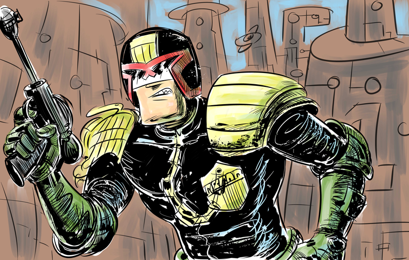
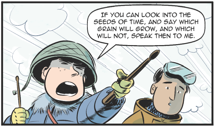
 Oh dear, I seem to have left this web presence thing slip again. Sorry about that. Pretty busy working on lots of projects, including contributing to an anthology and designing characters for an animation start-up, more of which I will reveal in good time. In the meantime here's a panel from a recent competition piece.. more about that too once the judging is done and dusted. Speak soon, stay frosty.
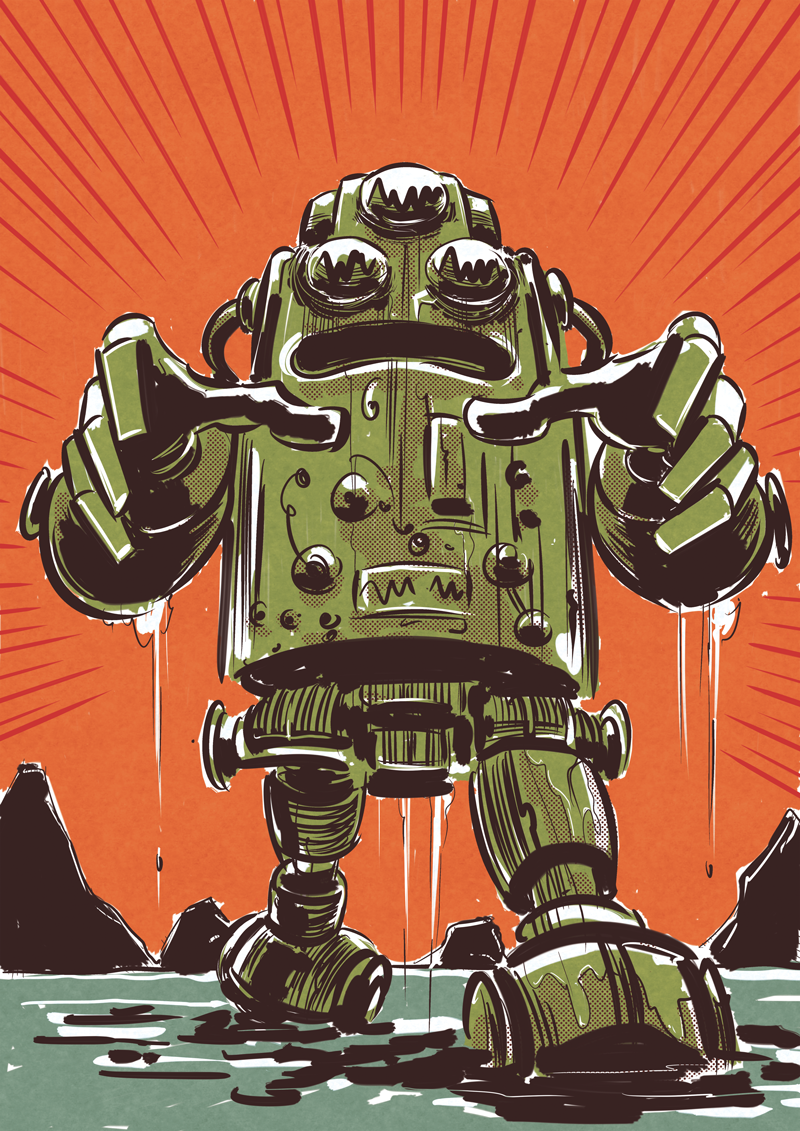
Another robot..
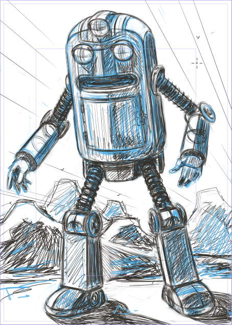
Robot drawing - step by step
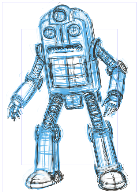 STAGE 1 - I created a new A3 document in Manga Studio. Using a sketchbook doodle as reference, I roughed in the robot's pose using a blue line first and then darkened and defined the basic shape of its body with a grey pencil.
STAGE 2 - still pencilling with the darker line, I've started to add more definition to its various joints, fingers, body cavity, etc. Also dropped in a background, which was a bit of an afterthought (not always the best practice!). Thanks to the blue line I'm able to see what I'm doing pretty clearly and am saved from making the page a grey mess as I work things out. The soft eraser tool in Manga Studio also helps me keep things clean. I tend to be quite a messy penciller and a bit of a hard presser so blue line definitely works for me.
STAGE 3 - Inks. Using the G-Pen nib in Manga Studio I draw in the basic outlines. I then pluck up the courage to put in the heavy black areas. Some zip-tone was then dropped in loosely for the mid tone areas. The brush droplet tool was used together with white paint to get some of those dented FX and also push back the mountain range. The upper legs and arms were a bit of a struggle here - I tried to draw those tube rings in a way that wasn't too mechanical but also not too sloppy. Not entirely happy with the result but time to push on with....
STAGE 4 - Colour! For this stage it's time to export to Photoshop. I then block in the basic flat colours on a new layer and add a custom pattern effect to get that watercolour paper look. The darker areas are added on a separate layer using a brush with 'wet edges'. Adjustment layers are then added to some of the line work to push the background further back. Finally I dropped in some highlights, again with a wet edged brush set to 'luminosity'. Done!
Next stage? Possibly getting this bad boy made into a print for the shop?
My other place (Tumblr)...
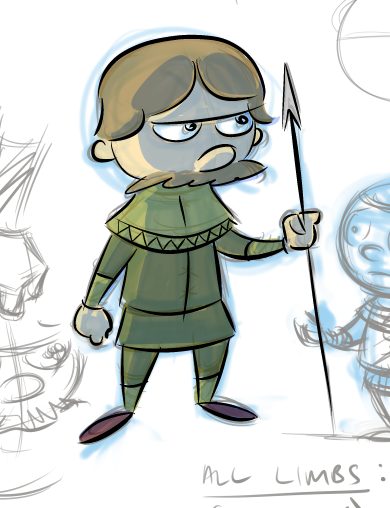
So here's a selection of sketches, doodles and scribbles that you can see over on my Tumblr site, called Jaime's Other Place. I'm currently mulling over making it my main news feed and linking directly to it from this site's main menu...we'll see. Anyway, do take a look - hope you enjoy!
Concept drawings...(new project alert)
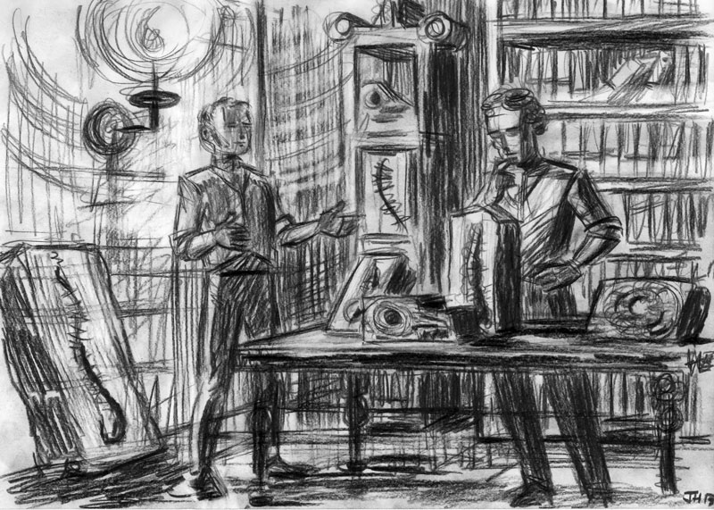
Some concept sketches for an exciting new Victorian period project I'm working on with the super talented Mark Pembrey (with his writing hat on). Won't say anymore for now except that there will be beasties in it...

